Home
Simple clean web design.
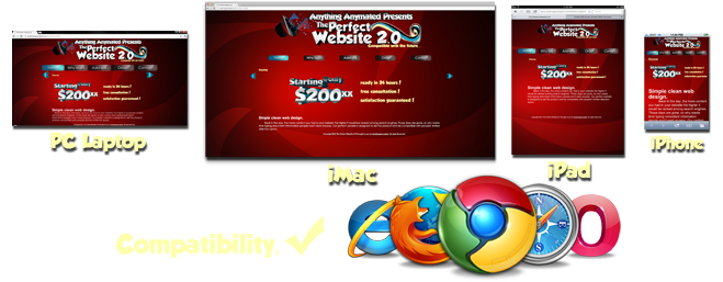
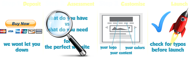
Do you know the kind of site that indulges in fluff and sensory overload? This is not one of those sites. Simple clean web design was the inspiration for our new product called The Perfect Website 2.0. Its design is intended to transform visitors into buyers with its "to-the-point" attitude. "The Perfect Website" focuses on the star of the show: your product or service.
Why buy?
Like water it fills any container!
Maybe you haven't seen other websites on a 27- inch monitor, mobile phone or tablet device. Well, when you see this one; you won't notice a thing. Read more
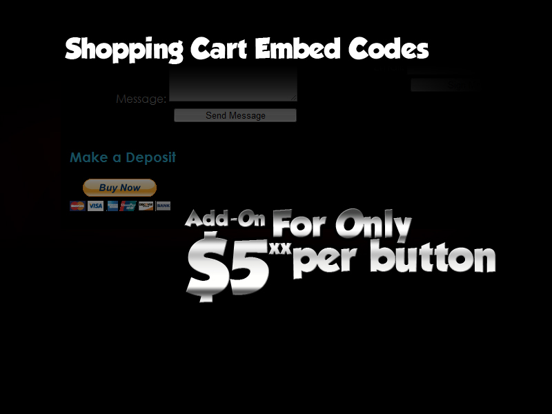
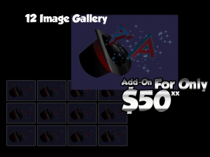
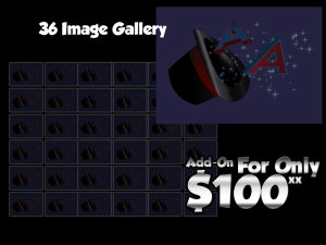
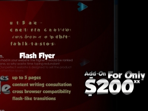
Add-ons
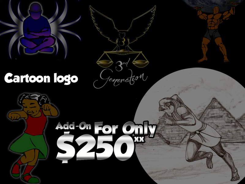
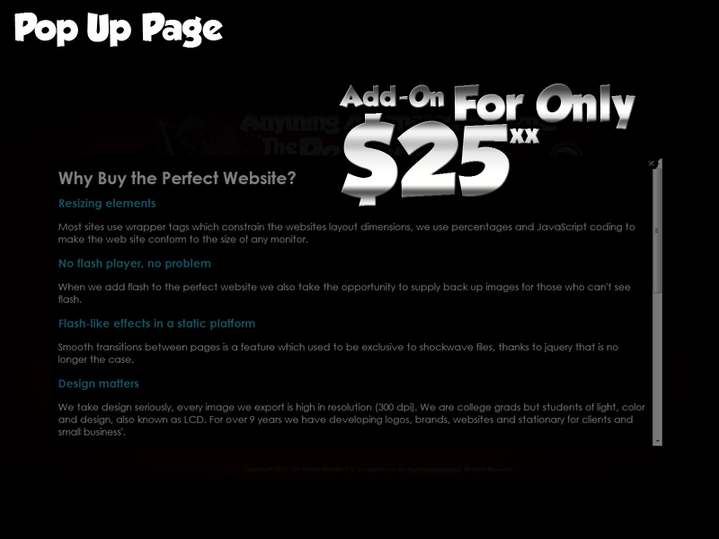
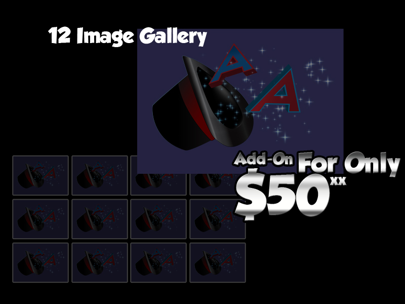
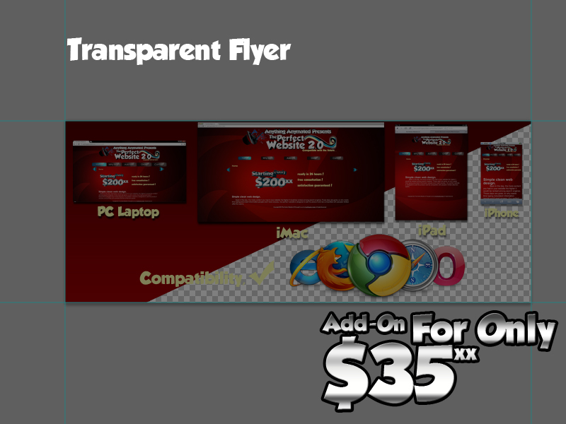
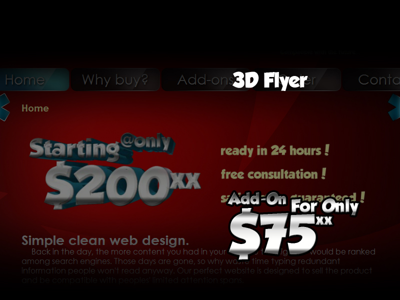
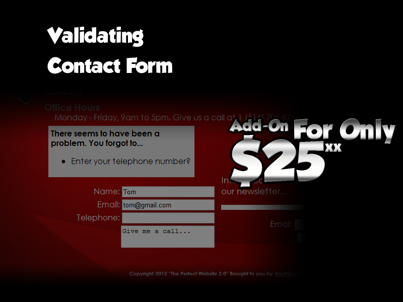
These features don't come standard but can be added for a very resonable price. Click on the thumbnails to enlarge the examples. For a complete list of add-on details click here...
Photo Gallery Of Examples
 |
 |
 |
 |
 |
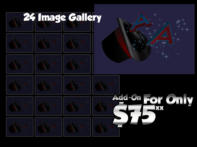 |
| Logo | 3D Logo | Cartoon Logo | Sub-Page | Gallery (12) | Gallery (24) |
 |
 |
 |
 |
 |
 |
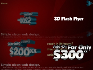
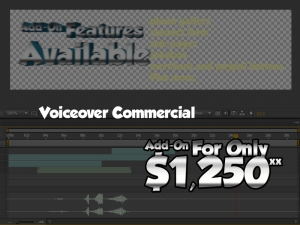
| Gallery (36) | Flyer | 3D Flyer | Flash Flyer | 3D Flash Flyer | Commercial |
 |
 |
 |
 |
||
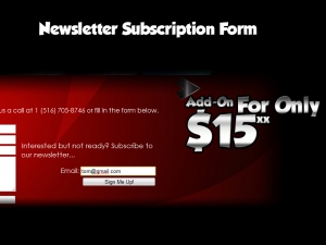
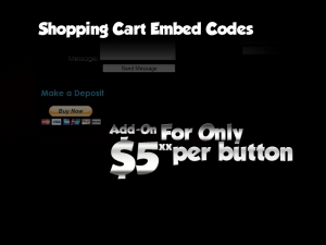
| Contact Form | Email Form | PayPal Codes | Video Code |


Contact
Office Hours: Monday - Friday, 9am to 5pm. Give us a call at 1 (877) 248-3330 or fill in the form below.
Copyright 2012 "The Perfect Website 2.0" Brought to you by AnythingAnymated. All rights Reserved